
Monday, August 29, 2011
Red Irises in oil
Sunday, August 28, 2011
Just Be yourself

I love zebras, and enjoy painting them, so thought I would try a torn paper collage...
I think it needs a little tweaking but will decide in a couple days if I want to change anything.
As I was doing this I was thinking of the people in this world who want to copy others, and not be themselves..thus the name. She has different stripes, eyes, etc. So she can just be herself!
Party Time Linda Rupard

This was painted from a photograph I took at Studio Twenty of Leata's goodies at Susie's workshop.
Friday, August 26, 2011
Sinatra

Monday, August 22, 2011
Big Spring Workshop


Kay in her colorful kitchen work area
We had a very successful workshop! Plus a lot of fun.
Kays studio is a wonderful stimulating place to be creative!
Saturday, August 20, 2011
Caviar Chef - torn paper collage

What do you think? Y'all missed a great class, good food, and companionship.
Thursday, August 18, 2011
In Honor of.......

This is done with the black Tombow pen & the pink is acrylic . love the Tombow pens ,but always end up using just the black one . I'm not through with it .....
Wednesday, August 17, 2011
Low Key

Tuesday's Lamesa's demo on Arches #140 cold press. Established dark values early with an underpainting of warms at the center of interest and darks on the perimeters...lot of pigment less water. The reference was the interior of an antique store...lots of 'things' make for lot of
shapes. When dry major darks were placed at or near found objects.....
After Dinner Surprise

After Dinner Surprise!
8x10
This name fits us around here...If there is any pie...it is definitely a surprise!
I started this at the workshop in Plains, and just couldn't get back to it, because our art show was starting.Then I was gone the next week. Finally, yesterday, I got to finish it. It felt so good to be back in the groove, in my art room. I hope to get some drawings done soon. Have a workshop this Saturday in Big Spring, so will be getting that together the rest of this week.
Saturday, August 13, 2011
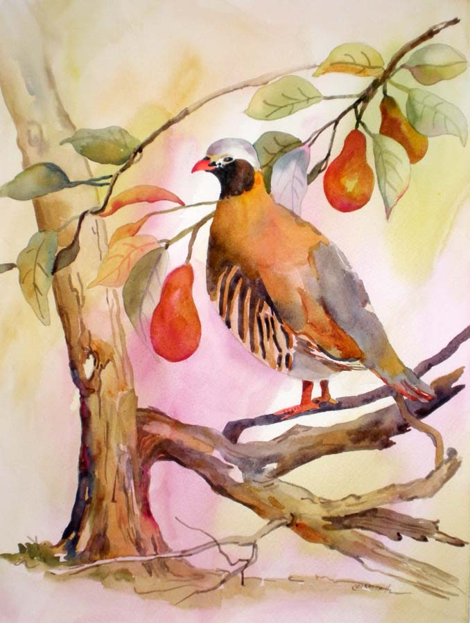
Partridge in a Pear Tree
Tuesday, August 9, 2011

Monday, August 8, 2011
Spring is Here

Our annual art show was this past week. It went great. Lots of hard work, but it is always fun. I got a 1st place on a portrait of the fisherman. (earlier post) and won 3 second places. Seven pieces sold, and am very honored that people buy my art. 'Spring is Here' is a new painting, and it won a 2nd place, along with 'Fashion Statement' and 'Rodeo Clown'..Both earlier posts.
I actually started 'Spring painting' a few years ago, and I put it up, then dug it out and finished it.
It is watercolor, with cut out flowers and then collaged onto the painting.
I painted the paper in shades of blue with watercolor, then used one of those metal cutters and cut out all the tiny petals.
Friday, August 5, 2011
Red Rose

This is a small commission about 8x10 of a friend's rose, watercolor, painted wet on dry. The background of course is imaginary as are the negatively painted leaves.
Monday, August 1, 2011
From Inside

I painted this first on paper as a class demonstration liked it well enough to put it on canvas. It's 18x24 and enjoy watching colors flow into one another mixing their own neutrals. This has a dominant low key feel with dark blues, purple, strong reds and hints of burnt orange. The colors give it texture needed for the inside atmosphere...
Bon appe'tit...
Subscribe to:
Posts (Atom)